
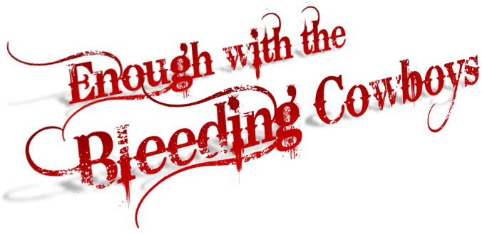
 It’s an awesome font. Honestly, when I first saw it, I was in love.
It’s a gritty font, with elegant curves that seduce your eyes and sharp, dagger-like accents that threaten to stab your brain. It’s gorgeous and dangerous.
But, it’s also a very distinctive font, which limits its usage. It’s not like Trajan (which is obviously the movie font) or Arial (which is for signs) both of which are generic enough to be repeatedly used without the general public catching on.
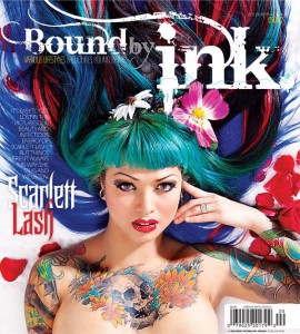 No, once you’ve seen Bleeding Cowboys (like in the logo of the tattoo mag “Bound by Ink”) you’ll never forget it.
It’s become a plague of sorts. It has eaten up the indie music scene. It’s a popular choice for novel covers.
And, I have to confess, I’ve used it myself in a quickly thrown-together YouTube clip (see below).
But at the risk of jumping on another font-hater bandwagon like the backlash against Comic Sans (which is actually a fairly innocuous font) I want to add my voice to the growing list of people saying enough with the Bleeding Cowboys, already. Let’s back away from the swirls and blades and faded edges.
Rainy Kaye
August 6, 2013 at 12:12 pm
Well said.